Tutorial: Tabard and Shield Patterns
How To: Patterns
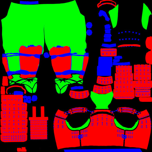
Patterns are a RGB (red, green, blue) mask texture. The different colors represent the three main color channels in digital images, so they can be thought of as three seperate masks on one texture sheet. Red is the primary/base color and should be the most prominent. Green, secondary, can also cover a significant area. Blue, trim, however, should be kept to a minimum and must only be used as trim.
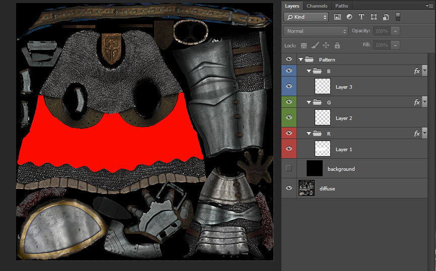
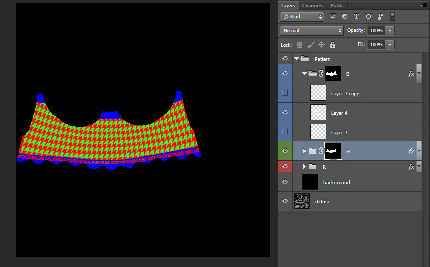
What follows is an overview of the process of creating a new tabard pattern. Note that the same things apply to shield patterns, except that they are obviously on a shield, not a body. To start with I'm going to open up my Agatha Knight template. This template is set up for each layer group to fill everything in it either red, green, or blue. So all I have is my red base, this base will also serve as my mask for the other colours, they're going to be within the area that's already red. The black 'background' layer isn't visible right now, but before I can save out my pattern and put it in game that background needs to be black.
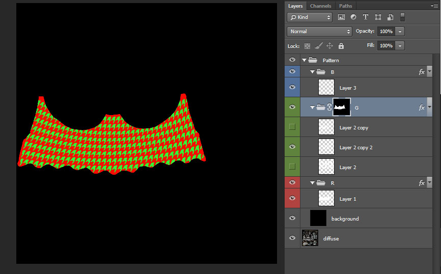
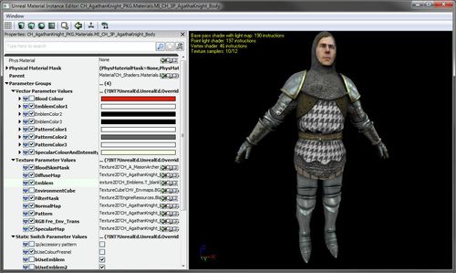
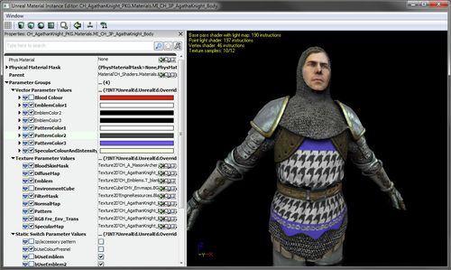
I've decided to make a houndstooth pattern. To do so I made a single shape, duplicated it a bunch of times, then warped it to the desired effect. I loaded my red base as a selection by ctrl clicking Layer 1 and then applied the selection to the green layer group as a layer mask. Now with my background layer turned on I have a functional pattern texture I can import into the sdk. And previewing it on the Agatha Knight it's looking alright. Pretty houndstoothy.
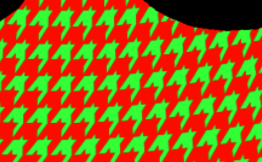
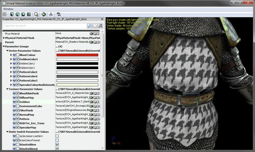
But now that I have it in engine, upon closer inspection I can see that this is not looking very good at all. My pattern is plagued with hideous artifacting. Oh no! How do I fix this?! Below is a closeup in engine, followed by a blown up screenshot of my texture. You might notice that the colour borders transition to a darker colour between green and red rather than transitioning smoothly from green to red. There is too much contrast over too few pixels for the texture compression to be able to deal with it nicely. We need to reduce contrast.
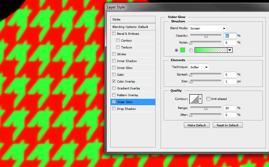
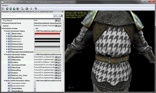
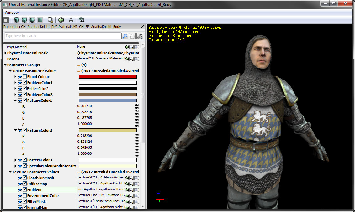
I chose to add a simple outer glow. I've added this to the layer group which already has the solid green colour overlay. Below are my outer glow settings and the texture, you can see that now the dark anti-aliasing while not completely gone is greatly reduced while keeping the pattern defined well enough. This isn't the only solution to smoothing out transitions, it's just what I chose for this case. And the following in engine closeup shows how much this helps smooth out the texture and get it looking the way I envisioned.
Now we just need some trim to finish off the pattern.
And that's all it takes to create a pattern.
